Appearance
Hero Section
The hero section is the prominent area at the top of each page that displays the main heading, description, and supporting elements. The Bankroll Casino theme provides a flexible hero system that adapts to different post types with customizable settings.
Overview
The hero section is automatically rendered for all post types and can be customized both globally (in Theme Settings) and individually (per page/post). 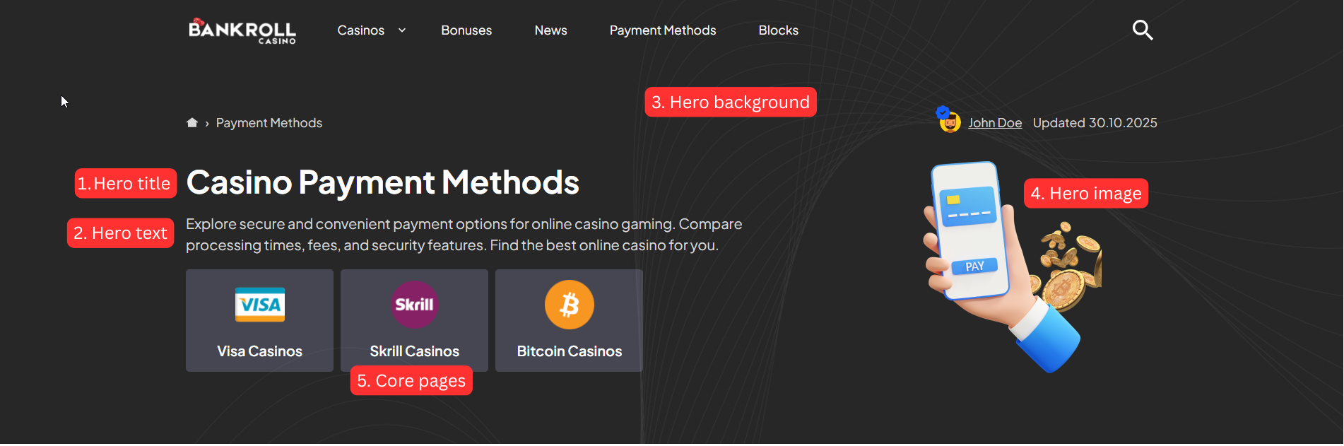
Default Hero
Page, Post, News, Payment Method, Software Provider are using default hero style and have access to the following hero fields in the Hero Settings section:
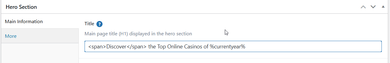
1.Hero Title
- Default: Post/page title
- Supports Shortcodes: Yes
- Supports HTML Tags: Yes (span, br, b, i, strong, em)
Available Shortcodes:
%currentyear%- Displays current year (e.g., 2025)%currentmonth%- Displays current month name (e.g., January)%currentday%- Displays current day (e.g., 15)
 will render as:
2.Hero Title Label
A small label/badge displayed alongside the hero title - useful for highlighting a category, tag, or short callout (e.g., "New", "Top Rated", "#1 Choice").
- Default: Empty (not displayed when empty)
- Supports Shortcodes: Yes
- Supports HTML Tags: Yes (span, br, b, i, strong, em)
Colors for the label are controlled via Theme Settings → Colors → Hero:
- Hero Title Label Background (
--hero-title-label-bg) - default: accent color - Hero Title Label Text (
--hero-title-label-text) - default: accent text color
3.Hero Text
- Supports Shortcodes: Yes
- Supports HTML Tags: Yes (span, br, b, i, strong, em)
Example:
Find the best online casinos in %currentyear%. <br>
<b>Updated daily</b> with new reviews.
4.Hero Background Image
- Default: Global setting from Theme Settings → Layout → Hero
- Recommended Size: 1920×600px minimum
- Format: JPG, PNG, WebP(recommended)
Background Overlay Settings (available when background image is set):
- Use Overlay: Toggle to enable/disable overlay
- Overlay Color: Color picker (default: #000000)
- Overlay Opacity: Slider 0-100 (default: 50)
5.Hero Image
Usage: Displays alongside hero content (logo, illustration, icon)
Recommended Size: 300×300px to 600×600px
Format: WEBP recommended
Options:
- Small (Max Width 200px)
- Medium (Max Width 300px) - Default
- Large (Max Width 400px)
6.Core Pages
- Usage: Display quick links to important pages
- Style: Configured globally in Theme Settings → Layout → Hero
- Available for: Pages, Posts, News, Payment Methods, Software Providers
Core Page Styles:
- style-1: Card-style style with page thumbnails
- style-2: Link list style
- style-3: No background style
Casino Hero
Hero Style: Four layout styles are available and can be changed in Theme Settings → Layout Settings → Hero → Casino → Hero Style:
- Style 1 (default) - Classic layout with logo, bonus offer, and a configurable display option panel (about, pros/cons, ratings, payments, or author opinion).
- Style 2 - Clean two-column layout. Left side shows the casino logo, title, about text, pros/cons, and payment method logos. Right side shows a sticky bonus card with rating, bonus offer, and CTA.
- Style 3 - Content-focused layout. Main area shows payment stats, payment method grid (with show-more), and a full bonus list with detailed attributes. Sticky sidebar shows star rating, established year, licenses and features.
Display Option (Style 1 only): Controls which secondary content panel is shown. To change it go to Theme Settings → Layout Settings → Hero → Casino → Display Option:
About Casino- Shows the casino descriptionAuthor Opinion- Displays author's review opinionPros Cons- Shows advantages and disadvantagesPayments Details- Displays payment informationRatings- Shows detailed rating breakdown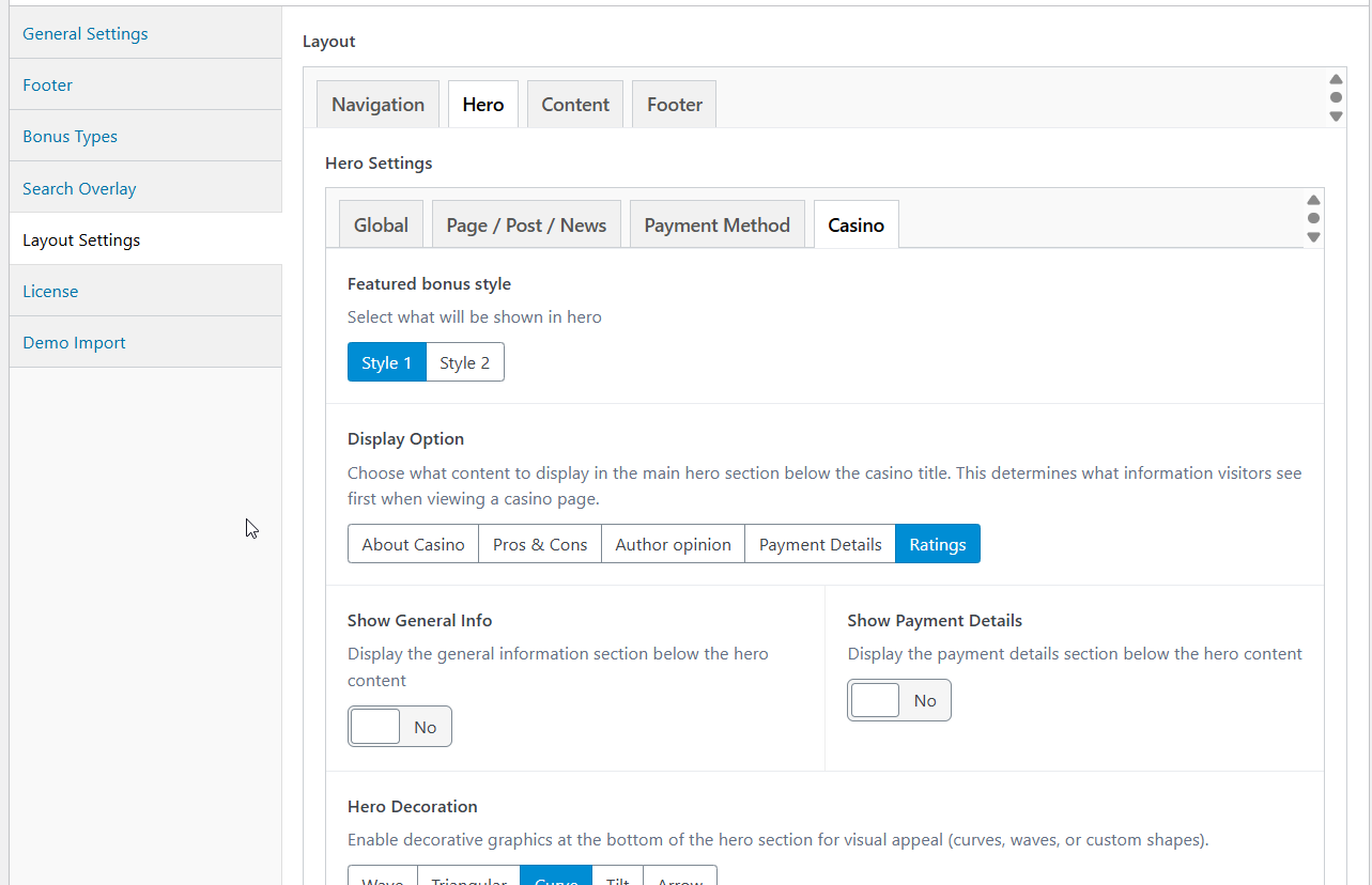
Slot Hero
The slot hero section is automatically built from fields defined in the Slot custom post type. These fields are set when creating or editing a slot.
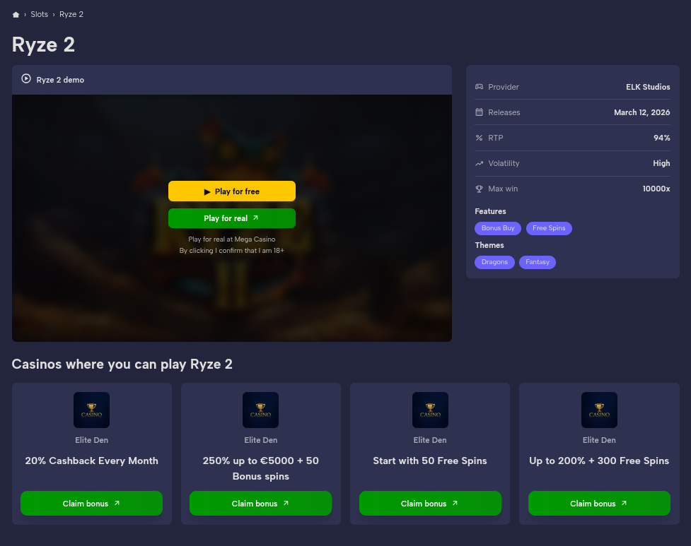
Fields Used:
- Slot title or Hero Title in Additional Settings
- RTP - displayed as a percentage (e.g., 96.5%)
- Max Win - formatted as multiplier (e.g., 5,000x)
- Volatility - e.g., Low, Medium, High
- Release Date - formatted as dd/mm/yyyy
- Features - taxonomy terms with optional images
- Themes - taxonomy terms with optional images
- Iframe - embed URL for the demo game player
- Featured Bonus - primary bonus to display in the hero
- Featured Bonuses - additional bonuses shown in the hero
- Featured Casino - casino linked to the slot for CTA purposes
- Software Providers - provider(s) that developed the slot
Slot Hero Styles:
Three layout styles are available and can be changed in Theme Settings → Layout Settings → Hero → Slot:
- style-1: Two-column layout - iframe on the left (8 cols), stats/details panel on the right (4 cols)
- style-2: Full-width iframe at the top, below it details (50%) and features/themes (50%) side by side
- style-3: No iframe - two-column layout with slot image on the left and featured casino + details grid on the right
Author Hero
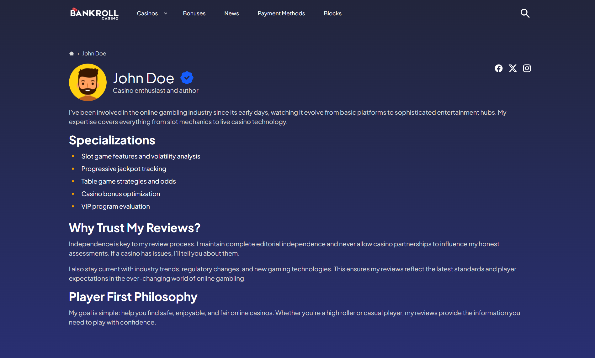
The author hero section is built from fields defined when creating an Author custom post type.
Key Fields Used:
- Author image
- Author name (
title) or Hero Title in Additional Settings - Author label (e.g., "Casino Expert", "Senior Editor")
- Author description
- Social media links (Facebook, Twitter, LinkedIn, etc.)
- Show verified badge
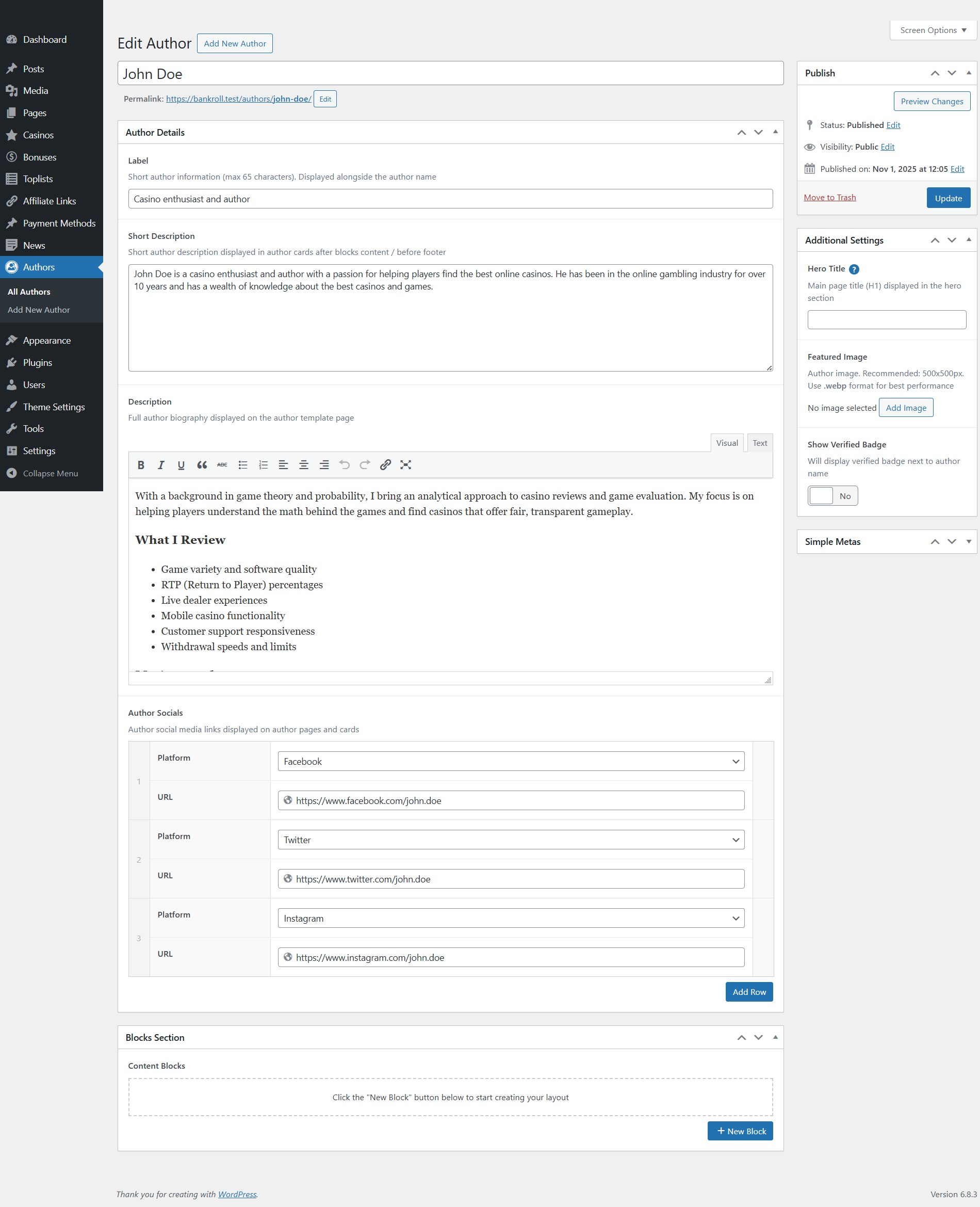
The author hero displays a circular profile image, verification badge, professional label, bio description, and social media icons for connecting with the author.